Tamarrilo - Killing Time
This is the finished video for killing time that Greta has edited. I am really happy with how it has turned out. It is very visually captivating and represents the music well. The only bit that I personally do not like is where the hands are featured. If i was editing the video I would have left them out as for me it breaks the illusion and gives the game away about how it was made, it also makes it look like it is am mature as it shows how low budget it was, where as before the hand there was no way of telling. That said I am still please with how it has turned out.
Thursday 31 October 2013
Looking for trouble : Research
Research :
I have been looking into simplistic layout where more
image is used then text. It is useful to see how colour
is being used in the images as that is something I may
have to take into consideration as all the picture from
the different hotels are different tones so grey scale
might work best.


Saturday 26 October 2013
TAMARILLO: Further logo development
Simon mentioned in a crit about copyright rules and typography, he advised that it is best to create the typeface yourself. I took this advise and adapted the century gothic 'tamarillo' into something of my own.
To make sure that the typeface reflects the concept of tamarillo I have ensured that is is very structured, Each angle is exactly the same as is the thickness of each letter. This very systematical approach is a representation of the bands structure within songs and systems.
I am happy with how the type now look and the fact that is is now created to be relevant with the concept of tamamrillo so it there for is an accurate represantion of them


Further experimentaions:
I have been experimenting with the new tamarillo applying it in different ways I have also created the typography for the sings killing time so that everything is matching and coherent


Friday 25 October 2013
Looking for trouble : Design Development (layout)
Layout :
When thinking about the layout I wanted it to as simplistic as possible, whilst maintaing an aesthetically pleasing and engaging layout. The reason for the need of a simplistic look is because this is going to a very content heavy book, there will be a lot of information and different locations, hotels, complaints so I am going to have to find a way of laying things so that it is clear and easy to follow what is going on.


Now that I have the initial layout I can now digitise it and play around more with how things will work.
When thinking about the layout I wanted it to as simplistic as possible, whilst maintaing an aesthetically pleasing and engaging layout. The reason for the need of a simplistic look is because this is going to a very content heavy book, there will be a lot of information and different locations, hotels, complaints so I am going to have to find a way of laying things so that it is clear and easy to follow what is going on.
This is the layout that I think will work the best in separating information and making the book look simplistic and approachable rather than content heavy, which is important as this is meant to be a humorous book so it can not look like a time heavy off putting book. I have sectioned and distributed the information through the use of tipins and the maps and also colour. Each city will be colour coded to a specific colour making it obvious that the city has changed. Another thing which will highlight this is that a map of that city will be placed at the beginning of each city change making the viewer aware that the city has changed to a different one.
For the information about each individual hotel I will use tipins and they visually are not as intrusive as a full page of text. It is a smaller space which will mean I will be more selective with what information goes on the tipin and thus more to the point and helpful. The use of the tipin will also help highlight when the hotel changes to different hotel as it will act as an obvious break between each hotel.
The actual layout of the book in terms of the complains, will be very simple, it will be purely typographic one one page and an image on the other page which will compliment the ridiculous complaint as the image will show the hotel perfectly.
Now that I have the initial layout I can now digitise it and play around more with how things will work.
Thursday 24 October 2013
CRIT : Tamarillo - Feedback from Tamarillo
Feedback from Tamarillo:
Feedback:
Today we showed Tamarillo the development of this project so far. They were both really pleased with how things are looking and how they will be represented. The logo is a work in progress but they are please with how it is looking thus far. The only thing that they would prefer not to happen is the 't' logo they said they have played around with using the T as a logo before and they don't like it. So the T is a no go. Except for that everything else got the thumbs up which now allows us to move forward and continue developing this project
Plan:
-finish editing video
- develop logo
- ep cast for killing time
Saturday 19 October 2013
Looking for trouble : Design Development (logo)
Logo Development:
For the front of the book I want their to be a title which would / could act as a logo and not just a title. This way it would mean that the publication has the option to be made into a range of items and also adds a feel of personality and character as a logo has to represent the product.
Below is the development for the logo. Some variations are very simplistic which although will probably look aesthetically pleasing, it does not capture the personality of the book that I want to achieve. The logos which do seem to embody personality are those which are based around the concept of the book 'Looking For Trouble' I tried to represent this in a few ways using the magnifying glass, eyes, and a fine tooth comb. These work better but I felt the magnifying glass and eyes were too obvious and the fine tooth comb to unobvious.

Through going through the trip advisor comments I started to notice that one word is used over and over and it is one that I rarely (if ever) have heard being used in a conversation. This word is 'Gripe'. When reading this over and over and doing the logo development along the side, the concept came about where by this book of people looking for trouble becomes as a collective 'a bunch of gripes' playing on the phrase ' a bunch of grapes'. This then gave me a clear visual which is not too obvious and the reader will understand the concept of the gripes through reading the subheading of the book and then through reading the book and seeing the word crop up so many times it will really hit home.


The above three variations of the logo are what I feel work the best in capturing the essence of the book. The bunch of gripes grape logo highlights the humour of the book as it works as a 'pun' making the audience aware it is a light hearted book. the use of quotation marks ' ' work as a way of doing 'air quotes' that people sometimes do when they are being sarcastic it shows that the book is about people looking for trouble.. but not real trouble ... 'trouble'. I also enjoy the aesthetic use of the boarder at the top and bottom this will work as a good way of enclosing the visual on the front cover.
Plan:
Now that I have the first initial development of the logo I will be digitise it and develop it further. The next step for this project is more research and more gathering of complaints from trip advisor, and also developing the layout.
Friday 18 October 2013
Looking for trouble : Audience / Context
Audience :
The audience is male and female 20-33, with a key interest in humour and also an interest in exploring Cities using hotels. They themselves will not be petty complainers and will see the absurdity and humour in the comments that people have written. They would individuals who many not be able to go on longer holidays abroad so may turn to city weekend breaks as an alternative or they may just have a key interest in cities themselves.
Context:
The context for where Looking for trouble would be sold would be varying Book shops. Looking for trouble would be suitable for travel and tourist shop, waterstone tourist section and things alike, but it would also be appropriate for shops such as village bookstore as it is a book with a humorous edge.
In terms of where/how the book would be used would depend on the user, but due to size and volume of what the book will become it would be most suitable to use as a book that could be referenced and looked through when in the planning stage of a trip deciding where to go/stay. So it would be a book that would stay at home and be something that can either be looked at for the humour or for the information and digested slowly rather then going through it all at once.
Plan:
Now that I have a clear idea for Concept, I have defined and recognised my audience and context and have began a body of research that will be furthered and added to, I feel I can now start developing the design at the same time as gathering the trip advisor comments which will be quite time consuming.
The audience is male and female 20-33, with a key interest in humour and also an interest in exploring Cities using hotels. They themselves will not be petty complainers and will see the absurdity and humour in the comments that people have written. They would individuals who many not be able to go on longer holidays abroad so may turn to city weekend breaks as an alternative or they may just have a key interest in cities themselves.
Context:
The context for where Looking for trouble would be sold would be varying Book shops. Looking for trouble would be suitable for travel and tourist shop, waterstone tourist section and things alike, but it would also be appropriate for shops such as village bookstore as it is a book with a humorous edge.
Plan:
Now that I have a clear idea for Concept, I have defined and recognised my audience and context and have began a body of research that will be furthered and added to, I feel I can now start developing the design at the same time as gathering the trip advisor comments which will be quite time consuming.
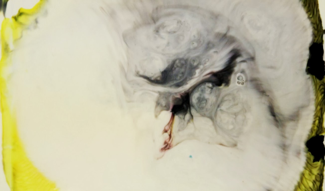
TAMARILLO: Music video shoot
Video shoot:
For the first tamarillo music promo video we are going to use a science experiment which involved milk, food colouring and washing up liquid. the effect when you drop washing up liquid onto the food colouring in the milk is very beautiful is caused the colours to react and mix and looks like streams are forming.
I tested the experiment at home first and I did not get a very good reaction. I soon discoered this was because I had put too much milk in the dish. To get the best results there only needs to be a thin layer of milk.


The results from the shoot were really beautiful. The camera settings were a little off which is shame as it hasn't capture the true full vibrancy of the colours, but i'm sure editing proces can sort this. I am please with how the shoot has gone and I am looking forward to seeing the end video


Video tests:
Subscribe to:
Posts (Atom)